Wednesday, December 2, 2015

My-Type Assignment

Combining Type and Symbol

This is my image That combines an image and words. I have a "G" with a stop sign witch makes an "O" shape. The stop sign is the compete opposite of the meaning of the words.


Be Positive

I wrote out "Become" in bold and used the rectangle tool to block the white parts of the letters. I then many text books with a white plus sign inside to replace the white parts of the letters.


Flower

I wrote the word "Rose" and the got rid of the "o" and replaced it with the imported picture of a rose.


Yes I am.

I wrote "I'M THE" and put a picture of a boom after it. I change the font. of the words to something cool looking and increased their size.


Chapped

I have a picture of a boom with lipstick on top of it. The meaning is suppose to be lip bomb. See what I did there.
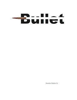


Accurate

I wrote the word "Bullet" in bold. I then used the rectangle tool to make a white space through the letters. Then imported the bullet itself at an end of the word.


Memory

I wrote the word "Forgotten" and just deleted the "o"s and made space.

Type Figures using Adobe InDesign

Tiger

This is my tiger. I used the letter "O" for the outline of the face. The ears are made from"C"s as well as the bottom of the mouth. The eyes are made from the number "0". The nose is a combination of "Y" and "T".


Sleepy

I wrote out "Falling Asleep" and adjusted wee the letters wee on the line so it looks like they are falling.


Fire

I wrote "Lots of Fire" and attempted to make the shape of fire within the words. I drew the shape and made the words separately an then move the words over the text. I used text wrap to place the words around the shape so it could be seen.


Unbelievable

I did a blank ace emoticon and had "Did you really just say that."


Slash

I wrote the words "Cut up" and used the eraser tool to get rid of some of the parts of the letters making it look like its cut up.

Selecting Text in Adobe InDesign

Click and Drag

This allows you to select what ever area you go over while dragging.


1 Click

Selects a spot for the cursor were trying can be done.


2 Clicks

Highlights and word your over.


2 Clicks and Drag

Highlights words you go over while dragging.

3 Clicks

Highlights the line the mouse is over and every thing in it.


3 Clicks and Drag

Highlights a line the mouse is on and any other its dragged over.


4 Clicks

Highlights a paragraph.


4 Clicks and Drag

Highlights a paragraphing any other you drag over.


5 Clicks

Selects everything. Real easy.

Low Quality Raster Logo Reconstruction in Vector Format

Preparation

Place the the paper on the scanner and set the resolution to what you want. The color mode and scale of the image you want to be scanned.


Clean Up in Photoshop

For the clean up I adjusted the levels of the black and white of the image. Then I went and selected the black parts of the images and went over them with the brush tool. I did the same for the white parts and all the grays disappeared. 


Live Trace in Illustrator

For the live trace of the image I found there wasn't much of a difference in the normal ones. The image stayed the same for most of them. 


Logo Reconstruction Using the Pen Tool in Illustrator

For this I used adobe illustrator's pen tool to clean up the edges and make nice curves. I used the elliptical tool to make an oval and fill in for the background to make it yellow.


File Formats

I used the file format of the program I was working on it with to save it.

Advice

Don't skip out on the step and be careful about what you change.

Tuesday, October 13, 2015

Vectorize Raster Logos

Raster RGB and Indexed color comparison

RGB

This is the better quality image. You go to RGB color mode and THEN change the size of the image. Tis is important to follow because this change allows it to smooth the edges to a degree. It makes it easier to get a better image.

Indexed color

This is crap. It was in index color when I started adjust increasing the image size didn't help. It comes out all pixelated and just doesn't look right. It may be hard to tell it really is a bad image.

Vector Image J-peg

This is the vectorized image I made. I used the RGB image as the base anti went through "high fidelity" image tracing. It is saved using J-peg file format.


Vector Image Giff

This is the gift saved image I made. There're a lot of different gift file formats an each has a slight change to the overall image. Some are small but others are noticeable so you need to check out other to see which would be best.

Vector File Size Comparison

Simple Image

This is the simple vectorized selfie I made. The started in photoshop were I messed with the "hue/saturation". After which it was moved to adobe illustrator and had "3-color" image tracing done to it. For the file size, it's 3.1mb and contains 4114 different points.

Complex Image

This is the complex vectorized selfie I made.The started in photoshop were I messed with the "hue/saturation". After which it was moved to adobe illustrator and had it go through "high fidelity" image tracing. The file size is 17.1mb and it has 54552 point in the image.

Curved line

This a vectorized line I made in adobe illustrator. It was made with two different anchor points. More were added on later to make the line more secure. There are 15 different points and the file size is 1.6mb.

Thursday, October 8, 2015

Vector Logo

 Batman

This is the batman symbol, if you didn't know. This image went through image tracing which got rid of the pixels it was made of. The quality was proved for this image because the jagged edge is now gone. 

Apple 

This represent the apple brand. From image tracing some of the quality was lose. The overall image still hold a nice quality. It may not seem apparent but the original was more shiny and bright.

Firefox 

This is for firefox. It went through image tracing and it doesn't look much different from before. Still a nice image. This is because the source image was high quality so not much was lost.

Sony

This is a crappy symbol for sony. This was made from a very low quality picture that I improved but that has its limits. If the original is bad it is very hard to get a good quality image.